Jan
2021
Dinosaur Hunter Diaries #101: Reprinted by popular demand!
Turok: Son of Stone #54
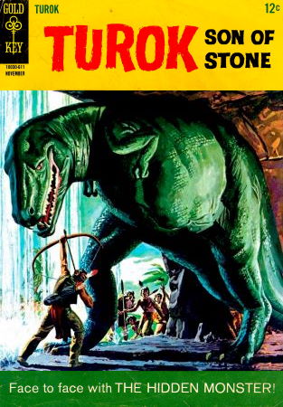
Original Turok writer Paul S. Newman gets salty over reprints.
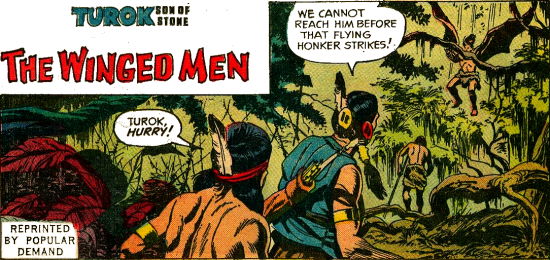
It's that time again! New adventures of Turok and Andar are on hold as we're
instead treated to The Hidden Monster and The Winged Men, both stories we saw
already back in issue #25... but not like this!
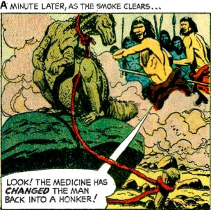
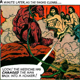
issue #25 (left) / issue #54 (right)
Both stories are fully recoloured, with subtly different takes on the existing
art. There's only so much it can change with it, mind you — grass is green and wood
is brown, but it's a curious glimpse at basic colour theory, noting where one
issue uses block-colouring and the other doesn't, or vice versa. This is the
kind of minutiae that no one should rightfully care about, but I love pointing
out. The reprints would bounce back and forth between this habit, sometimes
reprinting the issue exactly as it debuted, backup features and all.
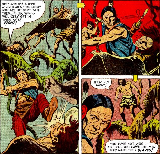
What's notable is that The Winged Men features a additional page in its climax,
not seen in the original printing! It's simply the middle of our heroes rising
up against the winged men, fighting them in the trees before turning their
attention to the slave camp. I already included it in my summary, but it's so inconsequential it makes
little difference to the plot with or without it; the story's still extremely
wham-bam as it is.
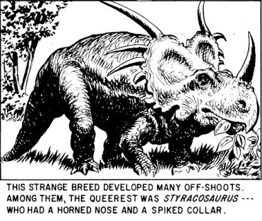
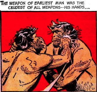
The backups feature brand new material just like the last all-reprint issue,
among them one-pages spotlights on dinosaurs with wings, flippers, and
armour-plated appendages. Young Earth documents the history of The
Weapons, depicting the eons-spanning legacy of human conflict conflict, which is
a trifle depressing to acknowledge... but Rex Maxon's adorable depictions of
Neanderthals never fails to light up my day, even when they're bashing the brains
out of each other.
Reprints, reprints, reprints... I hope you're not sick of hearing about them, because I've a whole featurette queued up on Turok reprints from the '90s and beyond!
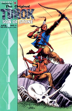
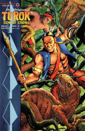
In 1992, Valiant began publishing volumes of reprints for its legacy Gold Key
property, Vintage Magnus: Robot Fighter, and in 1995 followed up with
similar lines for the other carryovers — The Original Doctor Solar: Man of
the Atom, and The Original Turok: Son of Stone. Priced a little
higher than Valiant's contemporary output, they were somewhat lavish
productions, sporting only one in-house ad per issue; they're cramming as much
as they can into those 36 pages!
In addition to brand new covers — Original Turok's by series regular Rags
Morales and X-O Manowar/Magnus artist Mike McKone — the stories featured
completely redone colouring by Cornelia Adams, giving the vintage art a new
lease on life.
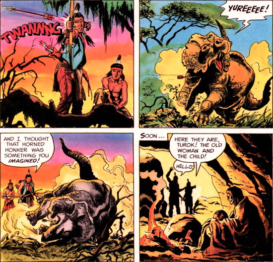
from The Original Turok: Son of Stone #2 (April 1995)
None of the series attempted to reprint stories in order, instead plucking
strips that highlighted elements that have since resurfaced in their modern
counterparts, iconic tales with standout art, or simply fun yarns. The Winged
Men from #25 and #33's Terror of the Bog were among the five reprinted tales,
likely to bolster the brief resurgence of their titular tribes in Dinosaur
Hunter #27. The other stories, while not personal standouts, are at least
emblematic of Son of Stone as a whole, albeit skewed towards human antagonists
rather than high-key honker encounters.
The comics were all newly recoloured by acclaimed colourist Cory Adams, apparently one of the big pioneers of modern colouring techniques through the '80s and '90s, and she brings a new flair to the classic art without overloading it. The dynamic block-colouring of olde is eschewed entirely for more naturalist colours, painting the environments in appropriately jungle-like shades. It's perhaps a bit 'monotone' without the splashes of reds and yellows to spice things up, but it's more accurate to the then-modern comic experience.
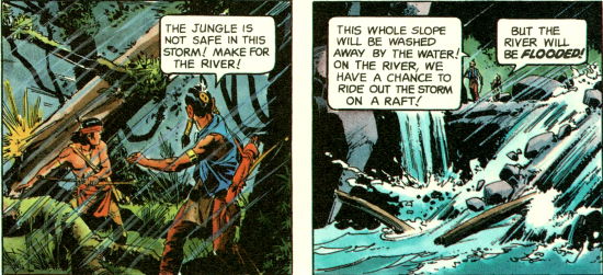
from The Original Turok: Son of Stone #2 (April 1995)
The new colouring really shines in its mood-building; the valley
visited in #42's A Vision of Home is painted a dark, cold blue. The second
volume's two stories really set the tone through its natural depictions of night
and day, better selling the mood of the scenes than the original comics, which
were limited by their muddy printing process; to render those panels any darker
would have lost all clarity. Not so with the '90's glossy paper!
It helps that Cory's colours truly factor in the thick, inky shading of the
original art, and uses only light shading and paint washes in accompaniment. It
doesn't try to squeeze oodles of detail between the inks, it works with what its
got to present some new texture to the old art, but always remembers to maintain
clarity and keep it readable at a glance.
This is my personal pet peeve when comics are recoloured: comic panels are more than just art, but tools to the story. The eye is meant to be guided, and something as simple as 'glossing over' detail through block-colouring or whatever helps lead the way; you know where to look, but you're free to get lost in the art in your own time. With the wrong kind of colouring, the kind that's overly busy and fussy in its level of detail, tends to be confusing more than anything.
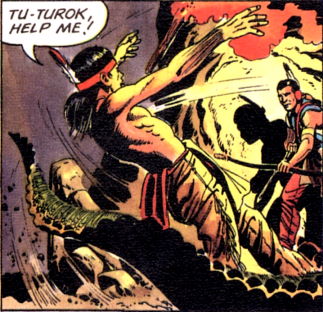
from The Original Turok: Son of Stone #1 (April 1995)
The recoloured panels of Moebius' The Incal are perhaps the most
infamous argument against recolouring comics; what was originally an ethereal
glistening metropolis of gleaming blues and yellows is now... not. It's brown
and grey and a thousand shades in between. It tries to maintain the original's
thesis of colouring the pedestrians in line with their surroundings to not draw
attention to them, but the darker palette nulls the effect.
The original sells you on the concept first of
all: of this dude falling into a sprawling vertical city, and you're free to
explore the detail at your leisure. The updated version is selling you on the
details first; of all the balconies and bridges and unique shapes, and muddies
the true focal point of the scene.
Anyway, long story short: the colouring in these reprints perhaps aren't what
I'd personally look for from a comic, eschewing the stylised dynamism for
straightforward realism, but it's fun to see it happen anyway. To have a glimpse
into both approaches is nice, and probably made the vintage tales less jarring
for modern readers of the era.
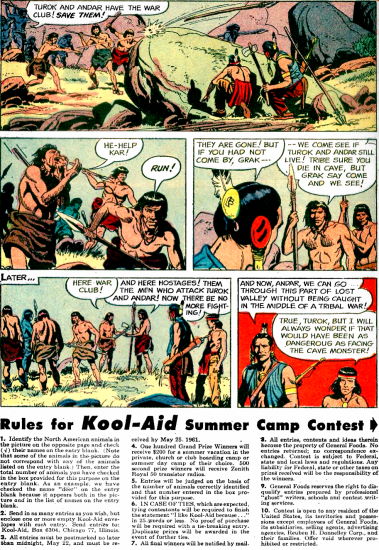
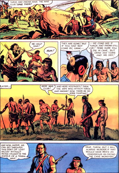
Turok: Son of Stone #24 (left) / The Original Turok:
Son of Stone #1 (right)
On a slightly more anal note, at least one of the stories has the artwork and
panel arrangement edited slightly from the original material. Lair Of Death from
issue #24 now features an unprecedented four rows of panels -- a shocking
divergence from the three-row formula! This is because the original Gold Key
comic squashed its panels to fit in details for the Kool-Aid Summer Camp Contest
(write in quick, submissions close on May 21st 1961!). The
final two panels were expanded into rows of their own, spacing out the artwork
to let them breathe a little. They look a little spartan, but it's a more
interesting solution than just cramming in their own ads to fill the gap. These
are ad-free comics, remember!
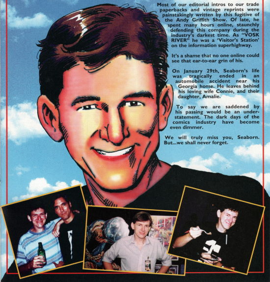
from Turok: Dinosaur Hunter #46 (July 1996)
The first issue ends with an afterword
from Valiant archivist Seaborn "VoskRiver"
Adamson, providing a basic overview of the series and its then-unknown creation,
its recurring themes, its iconic art, and so on. Adamson was an online comics
enthusiast who ran the
Valiant Universe Archive and apparently got into the company's good graces
through sheer goodwill,
enough to write text pieces for their reprints and also an entire one-off to
himself: Darque Passages.
Well, not so much a comic as a 20-page encyclopaedia entry on the Shadowman
villain, Master Darque, detailing his various powers and relations. Valiant was
so up on its lore that it published several releases that amounted to little
more than catch-ups for new readers, or exclusive scoops for hardcore lore
hunters. Darque Passages is unique in its largely prose-heavy format, with only
scattered illustrations and pin-ups as accompaniment.
Sadly, a car crash took Adamson in 1996 at the age of only 35,
and a memorial was printed for him in the final issues of Valiant's releases,
with Eternal Warriors: Time & Treachery dedicated to his memory.
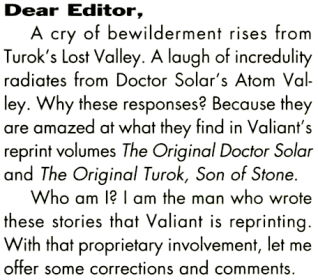
from Wizard #47 (July 1995)
Paul S. Newman, longtime writer of the original Turok: Son of Stone, took
particular umbrage not just with the changes made to these reprints, but to the
afterword as well! Issue #47 of Wizard featured his complaints as the star
letter: Seaborn refers to Lost Valley as the Lost Land
(understandable, given the new name under Valiant), misspells Alberto
Giolitti's surname, and sticks to the long-held notion that the creator of Turok
was unknown.
Newman credits his making and that of Doctor Solar to Dell Comics editor Matt Murphy;
I personally assumed Murphy was responsible for the name of Turok, and the
original stories were Gaylord Du Bois' handiwork, as seen in my wishy-washy
tirade in the Young
Hawk entry, but who am I to argue with the dead?
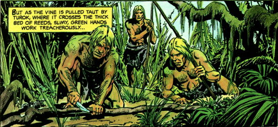
from The Original Turok: Son of Stone #2 (April 1995)
The art, too, gets savaged, particularly on how the modern colouring clashes
with the black inks; what was once shading he now interprets as scratches and
gashes. "The 15-year-old Andar looks aged enough to be Turok's father."
I personally don't see it, but go off, I guess. Even Gold Key editor Robin Snyder weighed in on the January 1995 volume of his
newsletter, Comics!, though I've had no luck finding it or any choice
quotes.
Paul mentions reaching out to Valiant ahead of time
in hopes of a token gesture for their reprints, either a royalty cheque or even
a writer's credit... and got neither. This wasn't the first time the then-71 year
old got bolshie about Valiant's take on his handiwork, having griped about their
bullet-spraying, battle-hardened new Turok in the Summer 1995 volume of The
Journal of Popular Culture.
Each issue of The Original Turok also contains a small gallery of painted cover illustrations at the end, cropped in strange ways and edited to remove the Dell/Gold Key logos from the top corners. It's a neat little extra, and arguably a key component of reprinting Son of Stone — the comics are fine, but it's the covers that well and truly jumpstart the imagination.
None of the three reprint lines were terribly long-lived; Magnus lasted four issues, Turok managed two, and Solar only got one! More were solicited in catalogues like Previews and Advance Comics, as documented on Günter Bouwer's The Valiant That Never Was, though their contents are unknown. Reprinting five stories out of several hundred ain't a great showing, but they were admirable efforts at rejuvenating the old material, bringing new life to old art. Maybe the next attempt would fare better...?